Content discovery for interactive learning

Summary
Year 2023
Type Re-design of entire content catalog
Role Product design
Product Datacamp
Content discovery and content catalogs
Content is in the core of e-learning. Datacamp has a vast variety of educational and interactive content on data science which are organized in ALPA loop: Assess > Learn > Practice > Apply. From individual courses and complete career tracks, to short practice sessions and portfolio projects – more than a thousand learning opportunities in different formats are open to Datacamp learners.
Before landing in a Data Science course users need to pick one in “Catalogs”, a typical card-like collection of courses, projects, tracks and alike. Catalogs done right is fundamental for a platform like Datacamp since success of learning to a very large extent depends on choosing the right course in terms of topic and level.
When we started the project, we were aware that there is a lot of room for improvement since these pages didn’t quite match modern standards, there were a lot of inconsistencies between content cards of different types, limited details on cards made people go back and forth between catalog and description pages and so on. Most importantly it potentially had an effect on enrolment rates.
We had a big challenge on our plate: make all 9 catalog pages work for content discovery.
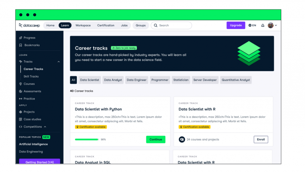
I led this initiative from design and requirements points of view taking care of the unification of cards and a balanced approach to quick and deep context. This project was quite UI heavy since all cards across 9 different content types had to be unified under the same style, interaction pattern, and the level of detail; alongside balancing unification with distinctive details. Below is an example of one of the pages that was improved, keep on reading to get to know how others turned out.

Goals
Make it easier for learners to choose the right content and decrease time on tasks in catalog to enrolment flow.
This was the process in a nutshell, scroll down to know more 👇
Learn
Data Analysis + Competition analysis
Define
UX audit and expert reviews + UX goals and Product goals + KPIs
Build
Design of cards with various states for Design System + Design reviews + A/B test preparation
Measure
Measuring control and target in A/B test releases
Team
In collaboration with PM, EM and system design teams.
How did we do it?
Our starting point quite obviously called for improvements. Here are some UX and consistency issues that were spotted:
Every catalog (page) had a different style of card which increased cognitive load
Some pages had banners and some didn't
Banners were taking up almost half of the page
Information on the cards was not sufficient, e.g. there was no level indicator on course cards and that alone can be a decisive factor
Filters were either not surfaced or had outdated UI
Below you can see examples of just 3 pages out of 9.

After UX audit I formulated several UX goals including consistency, clear progress states and information hierarchy on cards. The work started with gathering all metadata of different content, applicable progress states, visuals, categorization in terms of number of technologies and instructors (multi/single); as well as analysis of interaction requirements.
This project aimed to tackle all aspects of catalogs:
– Banners / Allocate on the page
– Cards / Understand what content is about in a glance
– Filters / Ease of finding the right opportunity
After a series of concept prototypes and reviews unified model was proposed.
Solution
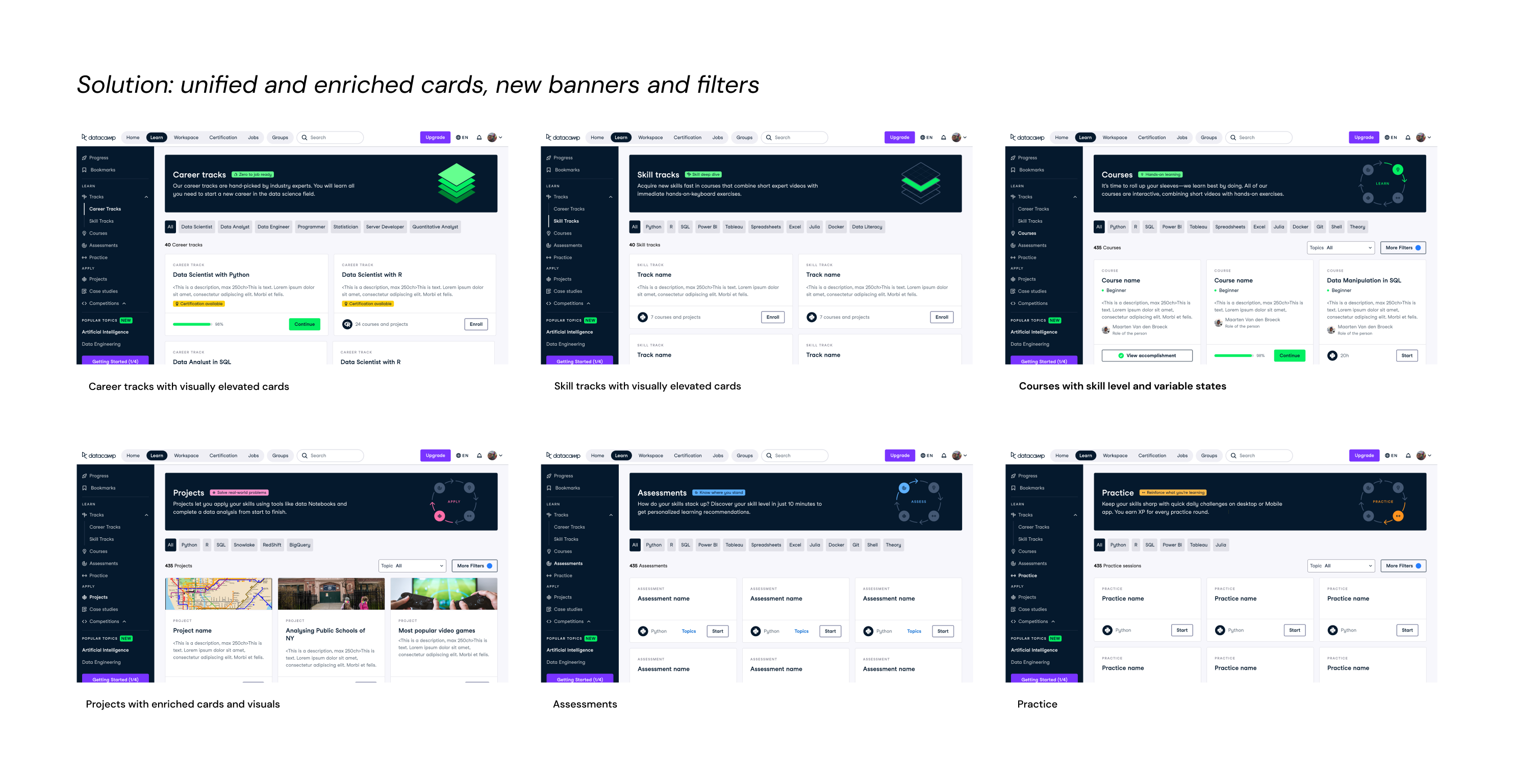
Redesign included 9 catalog pages that featured
– new comprehensive banners with improved copy and a concise tagline, such as Zero to job ready for Career track
– new filters for content with 2 levels: primary filter is technology or career type in case of career tracks and secondary filters for topics, prerequisites met and item status
– new cards with unified layout that slightly varied depending on type of content: for example, Career and Skill tracks were placed in a 2-column grid to make them visually stand out since taking a track is a big commitment, and Projects were given a visual to make it closer to the real world just like the purpose of practicing on real-world problems

To be pragmatic we broke the delivery into priority buckets based on page visits and enrolments into content types, which was decided based on data analysis.
As was mentioned above, it was a very UI heavy initiative. All states, item details, interaction patterns and screen resolutions needed to be considered and communicated to the teams. This alone definitely made it challenging and interesting. All its elements were later incorporated into the design system.
