User activation uplift
Summary
Year 2023
Type Growth improvements in various touchpoints
Role Product design
Product Datacamp
What’s up with new users?
Datacamp is an e-learning platform and our users are those who want to either start or upskill their Data Science skills. Have you ever switched a career or started learning something new? For most people, it is as much of a confusing time as it is exciting. And where there is confusion there is doubt, where there is doubt there is retraction.
The trigger for this project was a desire to help users get through the first steps of the journey with confidence and excitement. Our existing solution wasn’t ready for all use cases and didn’t offer a comprehensive breakdown of all learning pathways available on Datacamp. In the span of three months, we have introduced various changes to different touchpoints via A/B testing and experiments.
In this case study I will talk about changes to two onboarding flows: web onboarding and mobile onboarding. *Please note that the information in the public case study is limited.
Our goal was to improve activation of new users from several segments.
Outcomes
As a result, we improved activation rates for the majority of user groups.
Team
In collaboration with PM, engineering and content teams.
Process in a nutshell, scroll down to know more 👇
Learn
Data Analysis + Competition analysis
Define
Collaborative Design Sprint: hypothesis and scope definition
Build
Collaborative Design Sprint: co-design and ideation sessions + Refinements and development
Measure
Measuring control and target in A/B test releases
How did we do it?
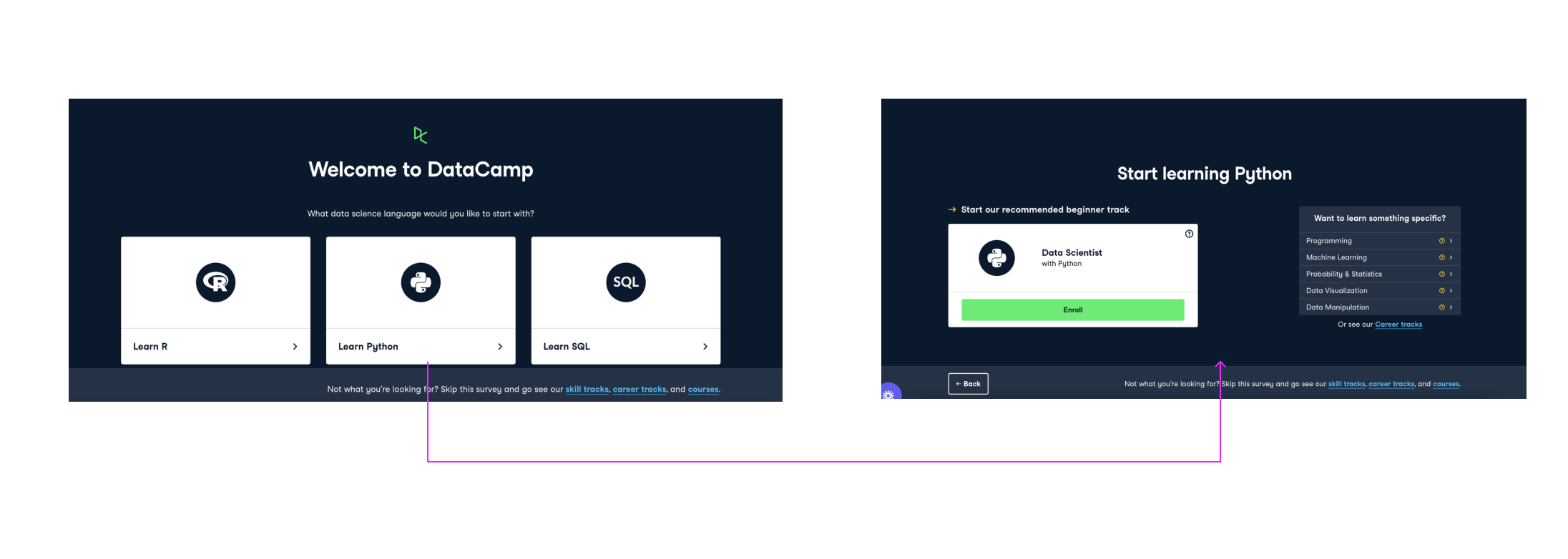
First, we knew that existing onboarding has a lot of room for improvement: besides various UI issues certain touchpoints failed to convert users. Onboarding also jumped straight into technology selection which alone is quite intimidating for many users.
Initial Hypothesis
After data and qualitative research we defined several hypothesis including:
Choosing a Data technology (Python, SQL, R) as the first step in the process is pushing novice data learners away Existing onboarding didn’t cater to people who are interested in learning tracks more than individual courses, and the ones that need more guidelines in choosing a career pathNovice users needed a boost in motivation and confidence of their choice of technology and/or learning trackWeb solution
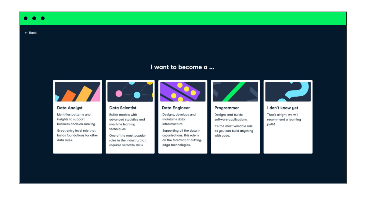
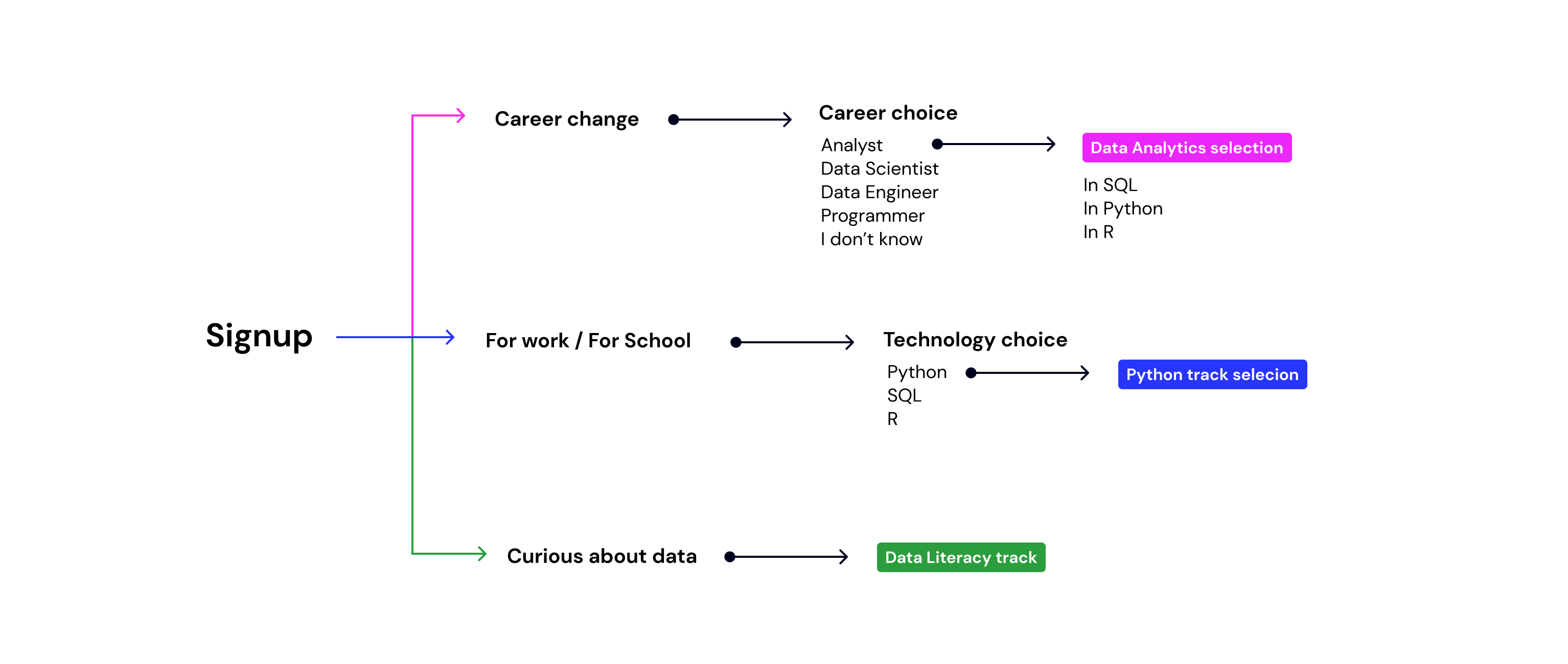
First, we introduced a multi-step onboarding with a snippet of a triage system that caters to different people based on their goals. So the first onboarding screen had four options with a tag line “I want to build data skills to…”:
- Change career
- For work
- For School
- I’m curious
Secondly, content cards (career, skill and courses) required a lot of improvements:
- They only featured a Title
- Didn’t have a clear CTA
- In cases when there was more than one choice of tracks cards looked alike and UI design didn’t make any differentiation between learning pathways
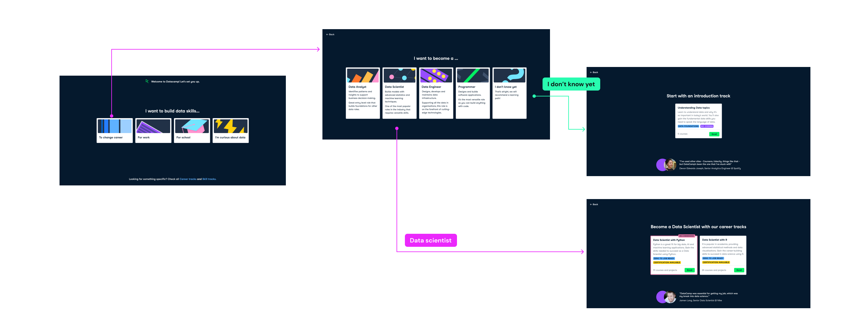
We reworked all copy for career pathways so it makes it easier for novice data learners to understand the differences, from both skill and career perspectives. For example, Data Analyst typically has a shorter zero to job path and this alone will play a huge role for someone who is just starting in data. We also made sure we include “I don’t know” option, since a lot of people aren’t actually sure what career they want to follow. We linked “I don’t know” option to an introductory track where our content team explains differences between data roles.

We also reworked course and track cards and included two types of tags to help users choose and understand what tracks offer:
- Content related tag: for example, “No coding” for PowerBI and Data Literacy courses
- And “Popular” highlight” for example, Python tracks are usually more in demand comparing to R tracks.

To tackle confidence, we embedded testimonials of real Datacamp learners who ended up switching careers on the bottom of the page.
Below you can find an example of a pathway of someone who wants to change a career but doesn’t know which technology and role to pursue yet.
Mobile solution
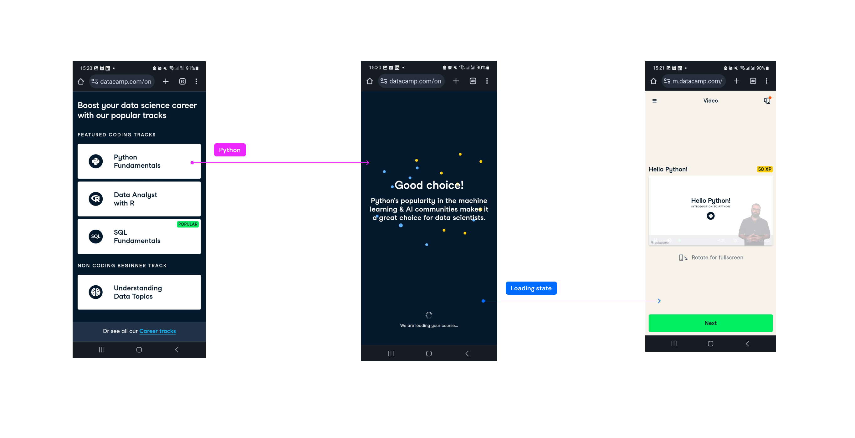
We took a different approach to mobile onboarding. Our solution was to cut a number of choices and eliminate goal selection to reduce time on task in sign up to content flow. We selected Skill tracks in 3 most popular technologies (Python, SQL and R) and offered one no-coding track. These groups were split into sections with clear labels: Featured coding tracks and No coding beginner track.
Once users make a choice, instead of a plain loading screen we introduced a choice affirmation screen on mobile, so that learners feel more confident about their choice. The copy links technology to career prospects, for example, “SQL is the most widely used database language and is essential for data analysts.”
Main challenge
During the process we faced a number of experience and organizational challenges:
- Define goals that resonate with all user groups
- Balance the number of choices so new learners don’t get confused
- Select content that accurately matches the goals
From an internal perspective, we also had to be very pragmatic with experiments, establish an experiment pipeline and a Design Sprint cadence that allowed us to move fast.
Process
We were lucky to have a set of interviews from previous research rounds to gain a sufficient understanding of context-aware user profiles and their pain points. We drew the first hypothesis based on these insights coupled with an analysis of UX data which indicated where the majority of clicks in existing onboarding go, and where the dropouts happen.
Competition and state-of-the-art analysis also took place which gave us a lot of inspiration. We didn’t only analyse ed-tech platforms, but also a wide variety of platforms that require an understanding of users goals prior to a kick-off, such as Mental Health apps, Insurance apps and more.
Throughout the whole initiative, we worked in one week Design Sprints that went from Problem and Jobs to be Done definitions to collaborative ideation session, followed by stitching and reviews.
We then run a number of A/B test and at times A/B/C tests to define the best-performing solutions. Truth be told, some of the experiments were flat compared to the control group, which we assumed to be an expected outcome. Some of them, however, had an astonishing impact!